Designing across web and mobile for a global relocation platform
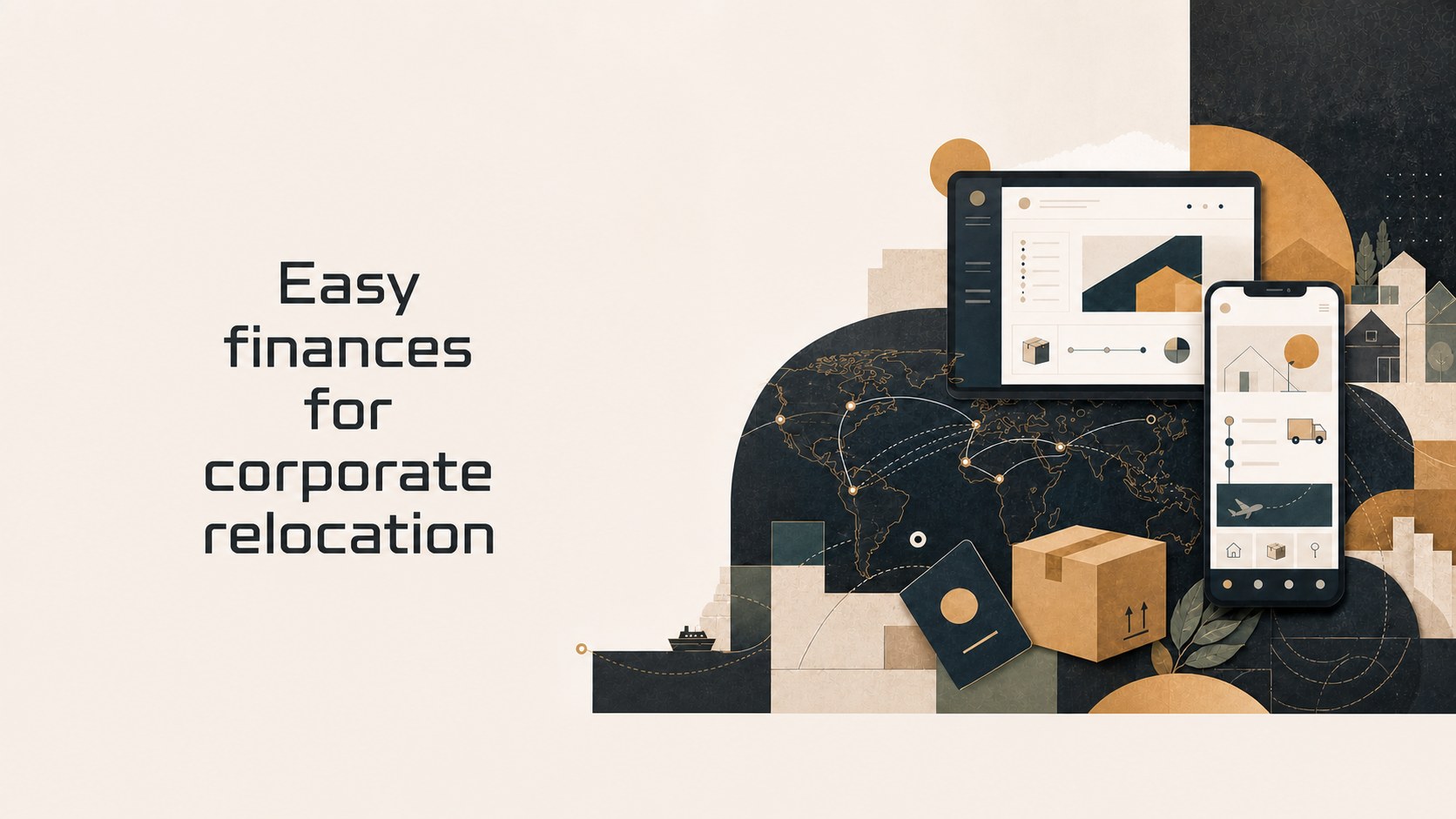
As Product Designer on SIRVA's Web Responsive and Mobile Application team, I worked across ReloAccess and SIRVA Connect+ — two products serving employees relocating for work and the coordinators supporting them.
Overview
Making a complicated process feel manageable.
SIRVA moves employees around the world for their companies — a genuinely complicated logistics process involving housing, visas, shipping, and dozens of moving parts. ReloAccess and SIRVA Connect+ are the digital products that make that process visible and manageable for the people going through it.
Context
Relocation is stressful; the product's job is to reduce that.
A global relocation is stressful by nature — new country, new home, unfamiliar process, tight timelines. The product's job is to reduce that stress by making an inherently complex process feel navigable, across whatever device the person happens to be using.
Constraints
One product, two platforms, low-tolerance users.
True multi-platform
Web responsive and native mobile needed to feel like the same product, not two different ones built by two different teams.
High-stress users
Most people going through a relocation aren't necessarily tech-savvy and are dealing with a genuinely stressful life event.
Live product surface
ReloAccess and Connect+ were already in use — changes had to work within what was already shipped, not a clean slate.
Two audiences
Relocating employees and the coordinators supporting them use the same platform very differently.
Process
One designer, two platforms.
- Designed across the Web Responsive and Mobile Application surfaces as the team's multi-platform product designer.
- Created user journeys for relocating employees and the coordinators who support them.
- Embedded within Agile teams, working closely with developers and product owners.
- Delivered Figma designs and Anima prototypes built for direct front-end integration.
- Facilitated UX workshops and stakeholder feedback sessions to validate flows before development.
Key decisions
One mental model, two surfaces.
Shared patterns, adapted per platform
Designed shared interaction patterns once, then adapted them per-platform rather than designing web and mobile independently.
Consistent hierarchy across devices
Applied the same visual hierarchy across both products so relocating employees didn't have to relearn the interface switching devices.
Simple, forgiving flows
Kept flows simple and forgiving, given how much cognitive load users already carry during a relocation.
Where it landed
Shipped across both surfaces, for real clients.
- Shipped features across both ReloAccess and SIRVA Connect+ for real, in-market relocation clients.
- Contributed to a more consistent experience between the web and mobile surfaces of the platform.
Reflection
What I'd tell another designer facing this.
Multi-platform design is really change management in disguise — the hard part isn't the interface, it's getting web and mobile to agree on a single mental model of the product.